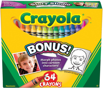
You guys, what is going on with Crayola? Have you noticed that gone are the days when Crayola crayon colors actually meant something?
When fall finally hits, I've always been all about the crayons. Never mind that I had a barely used box from the previous year, if just one crayon was worn down enough to necessitate stripping down the paper, or had been twisted into that ineffectual crayon sharpener in the futile hope that it would come out looking like new, I wanted -- I NEEDED -- a fresh box. Even today, the smell of leaves crisped by overnight lows makes me yearn for my back-to-school preparations of yore. It's not that I want to go back to school where worksheets, burpees in gym, and odd cafeteria smells ruled our lives -- I just want to shop like I am.
Disconcertingly, Crayola's now putting out colors that either sound like something you'd get out of a Slushee machine or defy explanation entirely. I mean, the color Mauvelous alone begs two questions: 1. when did we become a society where "Mauve" wasn't good enough for us? and 2. is Billy Crystal getting a cut of the profits?
Then there's what I like to call the ZZ Tops, where Crayola never uses one zee when they could use two. (Though their restraint is to be admired for keeping it Razzle Dazzle Rose when they could have easily gone with Razzle Dazzle Roze.) In this group we have the aforementioned Razzle Dazzle Rose along with Purple Pizzazz, Razzmatazz, and Jazzberry Jam. These crayon color names with their double-z implants are showy, vulgar, and unbefitting the proud Crayola tradition. They're stripper crayons among a box of ballroom dancers. It's true that three out of the four of these crayons are in Crayola's florescent category, but the shade doesn't matter since it's the names that put one in mind of Wet 'n Wild nail polish, not crayons.
Admittedly, old Crayola standards like Red Orange and Orange Red (retired in 1990) might not have been the most titillating names, but at least you knew where you stood with them. Red Orange was more red than orange and Orange Red was more orange than red, right? The same simple rule applied to Blue Green and Green Blue and all the other duplex colors.
Those were colors you could depend on to be honest and forthright, never pretending to be something they weren't, never threatening to put on pasties and a g-string to get your attention. In fact, the very staidness of the duplex colors is what made color names like Orchid, Umber, and Periwinkle even more enchanting, not to mention educating. Because while you might not have yet known what an "Orchid" was (or even how to pronounce it), you knew it existed. You knew the color name was based on a real thing because Crayola wouldn't play it any other way. Until now.
Like, I can't even begin to understand what is behind the pinkish-brown crayon called Fuzzy Wuzzy. Are bears pinkish-brown? Is it because Fuzzy Wuzzy had no hair and was ultimately determined not to be fuzzy that the corresponding crayon is a pinkish-brown hue of that could be seen as flesh-like? I honestly wish I knew. All I know is that, as a crayon name, Fuzzy Wuzzy is one of the weirdest in the box of 120. (Actually, looking at it, Fuzzy Wuzzy would make a totally great lipstick shade for me, but there's no way I'm putting something called Fuzzy Wuzzy on my mouth.)
Looking at a group of colors added in the 90s, it appears that Crayola came down with a case of the munchies, which resulted in colors like Macaroni and Cheese (1993), Eggplant (1998), Cotton Candy (1998), Asparagus (1993), Almond (1998), and Banana Mania (1998). One might hazard that, in an attempt to boost sales, the crayon company was surreptitiously encouraging kids to snack on the crayons and then present the wetly gnawed remains to their parents in a bid to get a new box. (Not that I would ever eat crayons. My tastes ran more to paste and Play-Doh -- mmm, salty goodness.)
Now, I could go on and on about these new-fangled crayon names that need to get off my lawn with their modern haircuts and loud music, but they're not all bad. In fact, some are kind of awesome.
Indigo (2000), for instance, is solid in name and shade. Actually, given that indigo is actually name-dropped in the Roy G. Biv color spectrum, it's one Crayola should have added years ago. Another crayon, Robin's Egg Blue (1993), is straightforward in color as well as being a lovely idea for a name. Crayola always rang true with the nature colors. (Except in the case of Mountain Meadow [1998], which sounds like a feminine wash.)
And now the best for last. It could be that my judgment here is clouded by the hours spent in the backseat of a station wagon searching for it on cross-country car trips, but I fully admit to adoring Purple Mountain's Majesty (1993) as a name and concept. The genius of the name lies in the premise that while it may not exist in nature -- all the mountains I've ever seen are brown, green, or grey -- it's stirring and evocative and probably makes one feel quite patriotic when coloring with it.
Speaking of purple and patriotism, Crayola, are you kidding me with Purple Heart (1998)? Maybe it's just me, but it seems a little flip? Disrespectful? to name a coloring book implement after a medal awarded when someone has died or been grievously injured in a deadly war. Much better to rename this particular purple "Harold" and leave the images of blood-stained battlefields out of it when one is striving to "stay inside the lines," don't you think?
With some exceptions, all these crayon colors feel frenetic and loud and, like so much of the world around us, desperate to grab our attention and divert it here! There! EVERYWHERE! The crayon colors of my childhood were quiet and calm. They weren't trying to compete for my attention. As soon as I opened a new box, they knew they had me 100% without any need to employ extra "zs" or food cravings.
I guess it's not so much that "you can't go home again," it's more, "you can't shop the back-to-school sales at Target again."
Cue sad trumpet.
Want to laugh and learn?
Buy my book from any of these fine online retailers.